 |
||||||||||
 |
||||||||||
Double Take: Revising and Improving Subtle Points in Realist Paintings Kenney Mencher
As an art historian and a professor who integrates writing
into my classroom curriculum I find that the process of making a painting
has a lot in common with the creative processes of writers. When
you find that your project has fallen somewhat short a painter needs to
find a way to critique a work while in the process of creating an image.
For me, my approach is to work things out first with a lot of thought.
Thinking about the painting's thesis (subject matter and iconography)
is the first and most important step a painter can take making a good picture.
As in a good story or paper topic, if your initial concept is weak then
your painting will be weak. The second step is to work out the formal
elements. Formal elements, composition, drawing, value, color, and
texture are the grammar of painting. Start with composition.
Make sure your drawing is accurate drawing and then move into the more
complex elements of a the painter's craft such as value structure, color,
and paint quality. If you cannot identify what's wrong with your
work, or you are unsure, take a moment to ask someone to critique you work,
either from your drawings or from the final work itself. Often a
second set of eyes can identify problems and you can edit out the bad stuff
and expand on the good. Painting is like writing because many of
the overall structural and technical problems that an author encounters
are analogous to the painter's creative process. Sometimes it's all
in the revision.
| Like writing, a painter often starts with a basic subject.
My "research" or initial inspiration can come from photos I've taken and
if the topic is good then I know the project will be too. Sometimes
when I've been a bit unsure about the subject matter of a painting I'll
start out with a thumbnail drawing just to see if I like what I'm doing.
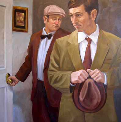
My initial idea for this painting was to get two "characters" together who belong together but not provide a complete story for the viewer. My goal was to create enough tension that a viewer would look at the two characters' facial expressions and the attitudes of their bodies and be inspired to create some sort of story around what might be happening. To do this, I started with two images of characters photographed from the same point of view. However, each of the characters' bodies express very different gestures and they both are looking in completely opposite directions. For me this was part of the tension. Initially I began with two very different formats for my thumbnail sketches. One thumbnail was horizontal, the other vertical. |
|
|
|
In the case of this painting I actually got all the way
into drawing the image on a larger more horizontal canvas and then I decided
the painting would be better if I tightened up the composition and went
with a square panel.
The biggest problem I identified in the horizontal composition was the problem of how to treat the environment around the figures. By switching to a square panel and moving the figures together I got rid of a problem I didn't know how to handle and refocused the picture on the two characters |

Hat in Hand, oil on panel 20x20" (For a step by step look at how I developed this painting
check
|
I think that Hat in Hand, is pretty successful
because I was able to identify the problems that detracted from the picture
and fix them by myself. To me, I feel like there is enough tension,
both in the composition and in the expressions and attitudes of the two
figures' faces and poses that I think that it is an interesting painting,
but, sometimes when I've got an idea for a painting I'm not really sure
how to pull off the initial idea. I can start with some interesting
ideas and develop reference images but I don't feel confident laying them
down in paint. This is where doing a developed study comes in hand.
A rendered study can allow me to "rehearse" my ideas and even present them
as a draft to an audience but without making the work of art a full production.
Often I have a friend, David Tomb, who is a fantastic artist, look over my finished work and I often go back and rework the really subtle elements he helps me to see in the work. Often a painting can be brought up to an even higher level of finish than I had suspected through his observations but often David isn't available until too late. So I remember what he taught me and apply it to the new work and I get many of my critiques from my wife, neighbors and friends. |

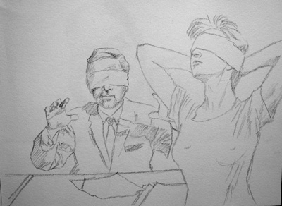
on Rieves BFK approximately 22x28" |

On the far left, Study for On the Same Page, is an attempt to work with an initial concept concerning choice and the choices that the "suits" behind the big desks make. The first study (top left) is fun but not really a great success because after showing this drawing to a friend, I was asked what the "goofy thing on the woman's head is." (They're supposed to be horns.) Obviously the horns didn't read well but I still liked the concept of the blindfolded business man. So I tried one more thumbnail and I liked it but felt the composition was too horizontal or broad. This time, instead of doing yet another compositional study I drew it directly in charcoal on a square canvas. |

|
The overall concept for the finished painting was altered
because my drawing allow me to step back and see if the overall idea and
execution was going to work. In the finished product for both On
the Same Page, and New Tricks, (below) were radically altered
by the fact that when I made the drawings I had a chance to show them to
other people.
For example, a friend who saw Smart Idea, commented that the idea was a little too cliché and predictable. This, coupled with the fact that I felt that the composition bugged me made me redesign the initial concept.
|
Initially, to me, the composition also seemed unbalanced and top heavy. The diagonal that runs from the upper left hand corner and down into the lower right is more spread out and less sharp. The rhythm of the way in which the figures and furniture are arranged across the composition is gradual and more evenly spaced. Doing a study allowed me to make mistakes and explore some formal issues before I began. In essence, a study can be a rehearsal of something that an artist may need to get right before attempting in paint. For example, in Le Marriage, I decided I wanted to elongate the torso of the male figure and give the image a more "lizard" like appearance. |
 |

Study for Le Marriage, red and white conte on blue paper approximately 16x20" |

|
| Occasionally, I get lucky and even though I may be nervous
and make a rendered preliminary drawing, sometimes it works out as a finished
work on its own. In fact, this preliminary drawing, turned into a
wonderful kind of dress rehearsal that allows me to have even more fun
in the final performance of making the finished painting.
Wonderful World of Disney, oil on wood 18x24" |
 |

Study for Tea and Sympathy graphite on white paper approximately 22x28" Tea and Sympathy
oil on canvas 18x24" |
 |
 graphite on Rieves BFK approximately 22x28" Shared Space
oil on canvas 36x48"
|
 |
 |
Here's a painting that I worked on for about a week or
so. When I "finished" it. I thought it was a good painting
but I couldn't quite figure out what to do to make it excellent.
I went through my checklist. I liked my initial ideas and felt that
they were clearly enough communicated to create some sort of dialogue between
the viewers and the painting (voyeurism, standards of beauty and the "male
gaze"). I also felt that the way in which the figures interacted
strengthened my initial thesis.
In terms of the paintings formal qualities, the value structure seemed accurate to my reference material, the color too. I liked the composition but felt that the image's biggest weakness was that the background was a little empty but I didn't want to busy it up with a window. The only thing to do was to put the painting away and think about it for a week or two. I returned to the painting several weeks later. I realized that the things I didn't like about it were easily enough solved. There was also one other thing that could be improved, the central figure although "fleshy," was not painted in enough of a "fleshy" way. |
 |
 |
The first thing was to modulate both the value and the temperature of the color on the wall behind the main figure. The second, was that I completely repainted the female figure and provided the flesh tones with more modulations and some texture. I also reworked the edges of the figure's hair and where her flesh met the background. The space and the figure were now more three dimensional and present to me. |
Sometimes painting is like writing. After
you've written that letter, essay, or story, you run spell check or have
someone look over your writing and you find that your project has fallen
somewhat short. Sometimes the strength or weakness of a painting,
a story or a letter has to do with the topic, your initial idea is great
but you need to flesh out your essay with a touch more research and development.
Sometimes the problems are minor but just some hard work. You just
need to clean up the works form, its spelling, grammar, vocabulary.
Usually you or your editor can identify the problems easily and once identified,
you can edit out the bad stuff and expand on the good. Finding an
"editor" for a painting is not as hard as you may think. You don't
need another artist, just another set of eyes and in this way. The
composition of a painting can be as easy as composing a good letter if
you can, first develop your ideas, second, work out the formal elements
and third get an "editor" to help you with your final draft. Sometimes
it's all in the revision.